Photography by Zeke Ruelas

Dear Color Diary,
As you may or may not know already, I decided to paint my bedroom blush pink at the beginning of this year. I’ve loved that color, but as a designer I’m constantly using my home to try out new ideas. So when Pratt & Lambert® Paints, the paint company who have been combining quality and beautiful color for over 150 years, reached out to me and wanted to collaborate, I jumped at the chance to re-envision my bedroom. Don’t get me wrong, I loved what the bedroom looked like before. I’ve always wanted to have a pink room somewhere in my home. But I’ve also always wanted a minty/aqua bedroom, so I decided WHY NOT? Let’s try something new!

The pink was purposefully a bit more feminine than I’d typically go in my own bedroom. But the thing I love about pink right now is that it’s having kind of a subversive moment. People are using it all over, not just in girly pink bedrooms. I loved how warm and inviting it was. But I wanted to try out a more soothing, relaxing color so I selected Pratt & Lambert Aloe (24-30) from their 2018 Color Trends Diverge Palette.

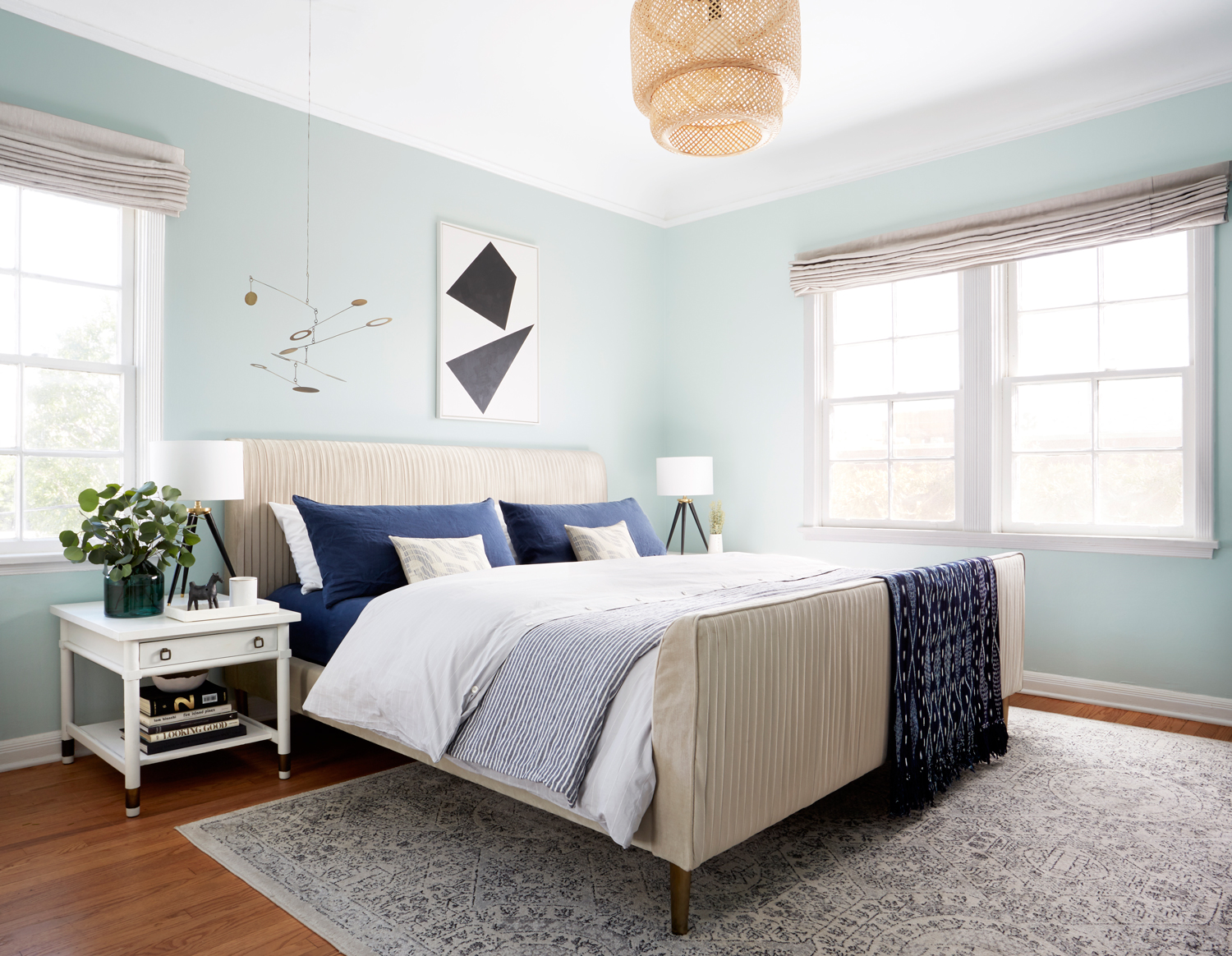
Resources: Wall Color “Aloe” by Pratt & Lambert, Tripod Lamp, Bedside Tables are Vintage, Marble Catchall Tray, Indigo Linen Sheet/Pillowcases, White Percale Pillow Cases, Grey Stitch Stripe Duvet Cover, Shashiko Wave Pillow, Striped Duvet Cover (Used as decorative blanket), Indigo Soltero Blanket, Labyrinth Rug, Custom Roman Shade, Geometric Painting by Anna Ullman, Hanging Mobile, Green Glass Vase, Ikebana Vase, Scenthouse LA Candle, Concrete Bowl by Ume Studio, Woven Pendant.


I feel like I’m constantly yelling at people about painting their walls. It truly is one of the most under-estimated forms of home renovation. With just a gallon or two of paint, you can completely change the look of your space. Try finding another design change you can make for the same amount of money that has a big impact.

Aloe (24-30), the color I chose from the Pratt & Lambert fan deck, is the perfect combo of warm and cool. Not so green it’s minty, not so blue it’s baby. This color was included in Diverge, one of Pratt & Lambert’s four color trends making up Beyond, a 2018 color forecast. Each year, color experts at Pratt & Lambert pull together color and design inspiration for the following year, creating the color forecast. The trend Diverge, includes minimalistic colors and takes inspiration from exploration of new worlds. The color palette where I selected Aloe (24-30) from includes gray-greens, earthy metals, and neutrals. I love combining aqua with black and white, so I added in one of my favorite Anna Ullman paintings and a bunch of black and white accessories. When I chose my furnishings, I chose items that would be amenable to many different color palettes. The Roar & Rabbit bed from West Elm (no longer available, RIP) and the grey roman shades from Loom Decor can go with so many different wall colors and they look amazing with Aloe.
I used Designer White (33-1) on the ceiling, trim, and doors. It’s a perfect white, not yellow and buttery but also not cold and clinical. The picture rail in my bedroom provided the perfect stop for the wall color. I love the contrast of a white ceiling, especially when it accentuates details in a room.


Normally, I’d be all about painting my own space, but the past few months have been so hectic and insane that I haven’t even had weekends free for something like this. I’m really looking forward to the next two months when things calm down a bit, because I like doing stuff myself. I like to joke that painting is good core exercise, but it’s not fully a joke.
I have a handyman I use pretty regularly who I found on Taskrabbit. He charges me hourly so I obviously wanted this project to go as quickly as possible. I was shocked, however, when I returned home from doing some errands to find the room completely finished. I chose Pratt & Lambert Accolade® Interior Premium Paint + Primer which coated extremely well and saved tons of time. It took him about 4 hours to paint the walls (not including the ceiling, trim, and doors, which took a bit longer because of all the detail work). Naturally, because I am a crazy perfectionist, I went around with the brush after he left covering any mistakes I found.

I found many amazing (and affordable) accessories to freshen up the room. I tend to have a lot of vintage in my makeovers, so I gave myself the task of trying to find easily-sourceable accessories for this refresh. One of my favorite additions is the new giant painting I made. I’ve been experimenting with a series of geometric paintings and I love the scale, simplicity, and movement of this piece.

These affordable candlesticks look like they’re from a super fancy/hipster/artisanal LA shop but they’re a total steal.

The paint color changes nicely over the day, cooler and more refreshing in the morning. Warmer and cozier in the afternoon. This is a good reason to ALWAYS test out paint colors before you paint the whole room. You never know exactly how a paint color is going to look in your lighting situation until it’s actually on the wall.

With this makeover I tried to go a bit more streamlined and minimal than the eclectic pink look I did before. After spending so many months this year accessorizing shoots for the book, filling every empty space with something cute and interesting, I wanted a bit more quiet, more space for things to breathe.

These Silver Dollar Eucalyptus branches were a complete pain to style (they just kinda wanna flop all over) but they smell amazing. I spent about twelve minutes sweating and yelling while I styled them. We shot this right before Thanksgiving when, naturally, it was 101 degrees in LA (silver lining: the paint dried in minutes!).


Resources: Wall Color “Aloe” by Pratt & Lambert, Blue Table Lamp, Tall Candle Holder, White/Black Enamel Tray, Michele Quan Black/White Link Chain Sculpture, White Geometric Vase, Metal Sculpture, Artwork by Orlando Soria (email info@hommemaker.com for purchase info), Woven Pendant, Egg Collective x DWR Dresser, Korchmar Weekender Bag.
I love my gold Japanese screen, so that’s being relocated to the dining room. The crazy contemporary art I made to replace it is strangely soothing in real life. It’s like just enough information to be interesting, not so much info that you get too stressed to sleep. I love the new bedroom and had so much fun with this makeover. I can honestly say I’m super glad I did it and that working with the Pratt & Lambert Accolade® Interior Premium Paint + Primer made it so much quicker (and for me more affordable). If you’re looking for an aqua color, this is a good one.
Now stop what you’re doing and go paint something immediately! If you’re looking for inspiration on color, check out Pratt & Lambert’s 2018 Color Trends (this collection is how I found my wall color). You’ll be glad you did!
Love,
Orlando
This post was created in collaboration with Pratt & Lambert Paints
Beautiful!!! Love a misty blue!
Saw a snippet of this colour in one of your stories and may have commented out loud “you changed the pink!!” But I love this, love the simple styling and the whole vibe. You’re right, paint has such a huge impact. Good work ?
Love the styling….
The space looks great! I love the new wall paint color.
And I know you just took them down, but I’ve always wondered… How do you hang Japanese screens? They don’t have hooks or hardware, and I’m afraid of damaging them. I’ve got one now that I’d love to hang but I’ve been stalling since I didn’t know how.
I was considering that CB2 mobile last night, but couldn’t pull the trigger until I saw it in a room, then I happen upon it while checking our your pretty new bedroom! Did it come with something to adjust the hanging height or did you have the buy something?
It doesn’t come with any extenders but I just used some twine and it looks very cute. I love it!
This color is lovely, but the pink was so good. #teampink
Great color. How does it look at night?
Absolutely stunning bedroom!!