
Dear Design Diary,
Literally the best thing ever is happening! Since my parents moved into their house I’ve been itching to redo their kitchen and now it’s finally happening. A little backstory: my parents moved out of my childhood home in Yosemite about three years ago and relocated to an area on the outskirts of Santa Rosa in Sonoma County. They found a great house where we can all hang out. An added bonus: my brother, his wife, and their kids live in a neighboring wine town called Windsor. It’s very cute up here and my parents love it. They hang out with my niece and nephew all the time and are somehow busier than they were when they worked (they’re both retired).
The only glaring issue with their house was its tiny kitchen. In their extensive home shopping, my mother’s one must-have was a kitchen bigger than the one in our Yosemite house (which was tiny. My mom and I literally spent all morning trying to find pictures of it but failed, maybe I’ll share them in a future blog post if I can find them). After searching all over Sonoma County and finding nothing that met all their needs AND had a great kitchen, my parents ended up settling on a great house in a beautiful neighborhood in the hills. The one problem: the kitchen sucks you guys. It’s tiny and there’s no storage.
My parents are great, and one thing I appreciate about my upbringing is that we sat down and ate dinner every night together and my mom always figured out different things to make. She doesn’t think of herself as the world’s greatest chef but I’ve always been impressed with her skills. Also she has a hoarding complex for Williams-Sonoma kitchen gadgets. I’m not sure how she fit all that stuff into our tiny Yosemite kitchen because it sure as hell doesn’t fit in their new kitchen. In fact, the storage issue is so bad that kitchen storage overflows not only into the family room, but also into the dining room (she has stuff hidden in cabinets and credenzas all over the house). My sister was here a few weeks ago while my mom was on a vacation to Mongolia and we had no idea how to unload the dishwasher because we couldn’t figure out where to put anything. My mom’s cabinets are as precisely-organized as a Tetris game. If you put one thing in wrong nothing else is going to fit. It’s a nightmare.
Enter Bertazzoni, an Italian appliance company operated since 1909 still operated by the Bertazzoni family. I used their range at Orcondo and Chatealando and they approached me about doing another collaboration, so I jumped at the chance to do my parents kitchen and finally give my mom a luxury kitchen she could be proud of. You might notice I keep referring to this as my mom’s kitchen. This is because she’s a lot more into cooking than my dad. DON’T BE MAD AT ME IT’S JUST HOW THEIR RELATIONSHIP WORKS, K?
Though, in his defense, my dad is really good at making tiny chicken drumsticks. Whenever my mom was out of town when we were little he’d make these for us and we called them “little chickens.” They were super delicious.

I was lucky enough to visit the Bertazzoni showroom and factory in Guastalla, Italy a few months ago where I was able to hand-pick appliances for my parents DIRECTLY FROM THE SOURCE. It was the most glamorous thing that’s ever happened in my whole life. I’m going to write more about that next week, so for today you’re going to have to settle for this cheesy ass picture of me pretending to make ravioli.

The Bertazzoni Museum and Showroom is an incredible place filled with amazing design history. I’d never been to Italy before and I fell in love with the Bertazzonis and literally every Italian I met. Okay I’m going to shut up about Italy now even though that’s basically all I want to talk about.

Just so you know who you’re dealing with, these are my parents (and my siblings). My sister’s wife (yes, there are two gay people in my family) was the one taking the picture. Trust me when I tell you that she is adorable. We’re standing in the living room, which has super high vaulted 70s ceilings that I used to hate but now I’m into. Don’t worry we took the tree down, this is from Christmas.

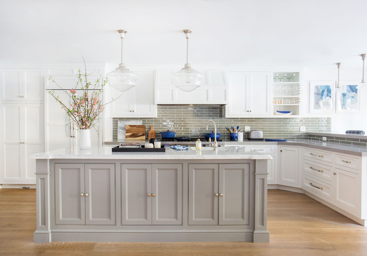
So back to the kitchen. Here’s where it is in its current state. I’m not going to pretend that this is the worst thing on earth. It’s not. I hate the ugly brown tile and the stupid granite countertops, but other than that it’s not bad. Oh, and I also hate the giant gaping skylight thing, which seems like a good idea but just feels like a vortex when you’re in the room. I think this kitchen would be fine if it were in a smaller house, but this is actually a pretty large house and the kitchen is way out of scale.
My parents have a bigger house than me or my siblings so we tend to do a lot of our holidays here. And also my sister and I are here all the time because we love the area so there are often more than just two people using this kitchen. As it is now, it’s annoying to be in this kitchen while someone else is in there. The goal is to make it a big enough kitchen that a few people can be in there cooking at the same time and not want to stab each other. To do this, we’re going to blow out a wall onto an outer deck and nearly double the kitchen’s size.
Here is the layout of the second story of the house and the plan for the expansion of the kitchen:

As you can see from the photos, the kitchen isn’t the worst thing on earth. We plan on donating the appliances because they’re decent and still work beautifully.


One of the challenges with this project is that my parents don’t exactly have congruent styles. My mom is open to contemporary design while my dad is more married to traditional/craftsman style. The house they bought is essentially a 1977 modern tract house that underwent a psychotic flip in 2012 and was remodeled to be Traditional/Mediterranean. To complicate matters, my parents chose a beautiful maple flooring that looks straight out of a minimalist loft apartment in Stockholm. There’s basically every style on earth happening in here and it’s kind of overwhelming. So choosing a design style for the kitchen has obviously been a bit of a challenge.
I’ve been looking for inspiration from one of my favorite architecture firms, Ike Kligerman Barkley, who seem to always do an amazing job blending traditional and contemporary styles together (which is obviously what needs to happen in a home like this with so many eras going on at once). It’s hard to find images of their kitchens but if you look at the way they design houses there’s always a melding of traditional conceits like wainscoting, shingles, or decorative moldings, done in a totally new and contemporary way.

I want the kitchen to feel classic and elevated. We are raising the ceiling by a foot (it’s dropped now for an unknown reason) and adding a picture window to make it brighter and more inviting. We’re also completely reconfiguring the layout so there is more space to move around and obviously a ton more storage.

We plan to keep the cabinet style pretty traditional, using shaker style cabinets, perhaps with a contrasting lower cabinet.

These plans show the general layout of the space after we’ve knocked down the wall and expanded onto the deck. We thought about keeping the island detached but because of the layout of the adjoining room it didn’t really make sense. I like the idea of the island, but I like the idea of having more seating and way more storage a lot more. I’m actually going to be doing a bit of an update in the adjoining family room as well, so I’ll be sharing those design plans over the next few weeks as well. There will be cabinets on both sides of the island, with those that face the family room being seamless and free of hardware (they’ll open from indentations in the top).
This is a rough idea of what we’re planning for the kitchen. You might notice the lighting and chairs are different than they are in the picture above. We’re still debating on that as well as the design of the island/peninsula. Part of me wants all the lower cabinets on the main wall to be that accent color and part of me likes keeping them white.

In these plans, we’ve added another sink to the kitchen. This is not only for prep reasons so two people can be using a sink at the same time if needed, but also because I plan on installing one of those water filtration systems (I love being able to get delicious filtered water from the tap). The current kitchen has zero lighting. So we’ll be adding under counter lighting where possible and spotlight/recessed lights everywhere else. This is going to be one of the major improvements. Nothing more annoying than a dim kitchen.

The color scheme is pretty simple and paired back. My mom loves blue so we chose the most beautiful pale blue color for the backsplash (it’s from Fireclay, see below). The below rendering shows what the cabinets look like when they’re painted the accent color. I love the splash of color there but also think it would be nice to leave them white and let that Fireclay tile have it’s moment. I’m also experimenting with different chair and lighting options, which you can see over on Emily Henderson’s blog today.


The Heritage Range from Bertazzoni was really the jumping off point for this whole design. I knew I wanted to use it the second I saw it so I devised a simple design plan that wouldn’t distract from its design. It’s a beautiful range, but it’s very ornate so I didn’t want to put it in a space that had too much going on.

I chose a refrigerator and dishwasher from Bertazzoni’s Master Series, which has different handles that are a bit simpler than the ornate ones on the Heritage series. I did this because I wanted the range to really feel like an accent. It’s such a complicated, beautiful appliance that I wanted it to be distinctive, sort of like an amazing sculpture in the middle of the kitchen.

Last but not least, I wanted to make sure to have a big ol’ wine fridge. After all, this is wine country and we gotta have a place to put all the bottles we gather when we head out wine tasting. Sidenote: I’m on a cleanse right now and I haven’t had wine in weeks and just looking at the bottoms of the wine bottles in the pic above is making me salivate. This fridge is by Summit available on Wayfair.

I’m super excited about the materials we’re using in the kitchen. It’s a perfect combo of warm, bright, and clean. As I said above, we’re using Fireclay Tile for the backsplash. The pattern is called Hexite and the color is Crate Lake. The floor is going to be 6×12 rectangular cement tiles from Rustico Tile in Clam. The countertop is from Cambria, it’s a quartz material and the color is called White Cliff.

So, there you have it! The general plan for the kitchen makeover that’s going to change all of our (my) lives! Check out my post on Emily Henderson’s blog today, which has even more renderings and some harrowing Ask The Audience questions.
Love,
Orlando
Inspiration Image Sources: Dan Mazzarini, Home Bunch, MyDomain, Emily Henderson, Marvin.
SaveSave
I think I’m on the wrong page to vote, haha. Anyway, I like option one of lighting and stools (mostly the lights) from Emily’s blog, and I love the idea of black hardware. Don’t force your moms into brass, let her be her….
Love love the blue tile, it’s gorgeous.
Could you share the dimensions of the new kitchen? We are planning a remodel and I love this layout but I’m not sure it would work in our (likely) smaller space? Thanks so much, and I love the design and can’t wait to see it come together!
Hi! The kitchen is roughly 11’x15′!
Absolutely stunning! Catherine is a lucky woman! Great family!! And soon an amazing kitchen to enjoy special times in! Fabulous Orlando!!?
It’s going to look beautiful! You have great taste in design. I was over on Emily’s blog and I like option 1 . Can’t wait to see more. ?
OK, the project looks amazing and the kitchen is going to be fabulous (love that tile!), but I have to say that the first thing that popped into my mind was: “NOOOOOOOO that beautiful deck is doomed!!!”. It is a big home, with big family, living and dining rooms, so my first though would have been to steal some footage from the dining room. I have a huge kitchen but no deck, and I’d kill to have one for dining outside. Well, not literally kill… But hey, to anyone their own!
As for the lower cabinets, definitely wite, so that those tiles pop.
Greetings from Italy!
Yes same! It looks like there might be more deck and they’re sacrificing the covered deck? But I still don’t understand why only a regular kitchen door to the deck. The peninsula should be attached to the opposite wall surely, then you could do French doors or stacking doors to open the room right up for amazing indoor-outdoor flow. I’m baffled as to why you wouldn’t do that!!
HAPPY BIRTHDAY!
Weird question, but I’m dying to know—what’s your mother’s connection to Asia? Is she an academic? Also, I love the new kitchen design and vote for black hardware.
My mom spent her childhood in Japan, so she’s always had a love for their art and culture and has passed that on to my siblings and me. She did a few Fulbright fellowships there and has gone back a lot. Such a beautiful place with an amazing history.
Your family is adorable! that is all. Good luck with the remodel!
Love this! But I want to talk about that door. My house used to have a back door (double doors leading to patio & yard) very close to the stove. It was a pain in the ass because walking in/out meant brushing past the person who was cooking, and keeping the door open meant blocking that person in. We called that stove the penalty box, and once we relocated the range life got so much better. Given the nice climate of Sonoma, it seems like people might want to go in/out of that door a lot. Any chance that door could be relocated so that people don’t walk right into the person standing at the range?
Hi,
I’m loving the idea of black hardware! I just redid my cabinets and went with Dove White and matte black hardware. Of course I always love Shoolhouse E. so anything from there is adorbs.
This is gorgina! I saw on Emily’s blog too and love Option 1 personally, but maybe Option 2 is best for them. Great design and the appliances…. love it all!
Question… do you use sketch up for your colored renderings? They are lovely!
Big hello from the uk! Love the kitchen and reading your blog.. do you mind telling me what program you use to do your renderings? Sketch up and ??They’re really nice ??
Photoshop! It’s very labor intensive but makes it way easier to select hardware, finishes, and lighting!
Can you threaten to never come over again unless she gives in to brass? If not then black. haha
Happy Birthday!
I like option 1 with the brass hardware. Even though your mom wants the black, I think she will love the brass with that beautiful black range. I also vote for all white cabinets since you are doing the light floor. Those chairs from CB2 look comfortable.
White cabinets so the tile can stand out. As a mom, I love how much you love your mom!! Go Ormomdo! Are you going to add a new deck/patio somewhere?
There’s actually already a pretty sizeable deck out there so we’re not going to add any more to it, we might swap out the ugly metal shade covering out there though. That’s a whole other project I want to get done…
Looks awesome! I think it will be beautiful! Your mom is so lucky! You are a great son! If you need someone to donate those appliances to my family and I could really use them. Good luck.
We have that stove! I call him Signore and he’s gorgeous. I couldn’t find a model around me and found very few photos of it in the wild when we were shopping. I know you saw it in Italy, of which I was/am INSANELY jealous, but I’d be happy to share a photo if you or your mom would like to see it in someone’s actual kitchen. I’ve also been playing with the little baby stove to see what fits. I hope your parents enjoy it. The whole thing is going to be awesome.
Excited to see your parent’s kitchen renovation! Also, love the renderings! what program is this?
Hi! These are made in Photoshop. It’s super time consuming and I only really do it for projects I’m writing about online but it’s very helpful for figuring out what the finished space will look like!
Such pretty tile! I’d go with white lowers to let them shine 🙂 Have you heard of CG Sparks? I could see some of their lighting working well in this space: http://cgsparks.com/light/ Can’t wait to see how this turns out!!
This looks awesome! The contrast between the cool blue and the warm wood of the stools is my favorite part. Btw, it was lovely to meet you yesterday at the Peet’s coffee in Santa Rosa and see you working on this post. I hope you had a nice 4th of July!
Oh my gosh, I’m SO excited about this, Orlando. The back splash, counter top, and floor tile combo is pitch perfect. It does make me wonder, though–how is tile to stand on in a kitchen? My parents’ houses always had either linoleum or wood so they had a little give. Nice for standing while prepping or washing up. Will you put down a squishy rug somewhere? Or is it no big deal? That tile is sooo gorgeous. I’m surprised to find myself drawn to and scared of it at the same time. Ha!
I love how the new window looks out over irish countryside 😉
The tile is beautiful. I love the white cabinets with the island being the accent. Over on Emily’s blog I really like Option 1. so clean (those white pendants). Is that really the view out their window? So pretty! (I went to SLO once, rolling hills and vineyards. Beautfiul!) Excited to see it all come together in real life.
Can I throw a wrench in the conversation? I love that blue tile backsplash, however, I am feeling a disconnect between it’s shape/pattern (and general aesthetic) and how it relates to the the surrounding landscape of your parents’ home as well as the beautiful range from Italy. It’s not that I don’t like it, it’s awesome! But I wonder though how something more organic or neutral would look?
I don’t have enough design sense to vote, but I know you will make if fabulous. I’m not sure I would be able to donate that stove to my mom, it’s just gorgeous, and she would be happy with a Kenmore, anyway. I think you’re a very generous guy.
Your mum is so lucky! (And your dad is lucky too!) The plans look great! I saw those tiles on your Insta-story and love them, such a great, interesting shape. I would love them with all white cabinets!
What a kind heart you have, so lovely that you’re doing this for your parents.
One time when my (now 15-year-old) son was tiny, we were on the bus and I was reading aloud to him.
Another passenger asked if he’d read to me when he was able and I wasn’t.
I hope he grows up as sweet as you grew up to be.
I have relatives living in Windsor. Super pretty vacation destination.
May I make a several observations?
I love the blue cabinets on the bottom option.
I would suggest embellishing further with patterned cement tiles on the floor.
This speaks to a deeply held personal vendetta against white or light colored floors in the kitchen.;-)
Knifes, spills, exploding pressure cooks all conspire to leave permanent reminders of their bad selves.
Also suggest a pretty, luminous, glass, fish scale/scalloped tile pattern for the black splash.
A touch of the Japanese sea feeling.
The geometric one you chose is pretty, but there are so many straight lines in the kitchen renderings,
that I think this would a some nice visual softness and radiance.
One more thing. On the side wall that abuts the deck, suggest French doors or some kind of wide, folding (similar in feeling to shoji screens) or sliding doors. Would be a treat to easily step out onto the deck, roll out refreshments on a cart, shoo out little ones, etc. (Rather than walking past the island, past the stove.)
I look forward to reading your book. I get a great deal of enjoyment from reading your writing,
Felicitations, xox
Sorry, one more thing, then I’ll stop. 😉
How about extending the black splash tile up to the ceiling, maximizing the prettiness.