Photography by Zeke Ruelas

Dear Diary,
Remember that one time like ten million years ago when I told you I was renovating my parents’ kitchen? RAISE YOUR HAND IF IT’S BEEN SO LONG THAT YOU FORGET ABOUT IT. ALSO RAISE YOUR HAND IF YOU’RE LIKE “DUH I REMEMBER BUT WHY IS HE HIDING THIS KITCHEN FROM US???” Well, a few reasons. The project began almost two years ago during the holidays when I started showing my parents renderings I’d made of what their kitchen could look like if we expanded it onto a deck previously occupied by an awkward deck. They were like “COOL STORY ORLANDO” until Bertazzoni busted through the wall like the Kool-Aid man screaming “HERE HAVE SOME FREE TOTALLY GLAMOROUS LUXURIOUS ITALIAN APPLIANCES!” It was the greatest, most heartwarming moment in all our lives and my parents were like “OKAY FINE LET’S DO IT WHAT COULD IT COST, $10?”
Keep in mind, this was December 2016 and we basically thought the world was ending (side note: it did) so my parents were probably just like “SCREW IT WE’LL ALL BE DEAD SOON ANYWAY.” We set about finding a contractor in early 2017 and had one selected by March. We were pretty much ready to go but construction didn’t end up starting until August 2017, lasting until May 2018. So yeah, this project was LONG. But it’s funny how something can be stressful and take so long and then just months after it’s completed you totally forget about how ridiculous the process was. Today, on this blog, I will be chatting about all the appliances, furnishings, fixtures and finishes I chose for this project. Over on my wife Emily’s blog, I will be spreading even more juicy gossip, chatting about things I would have done differently if this were my kitchen.

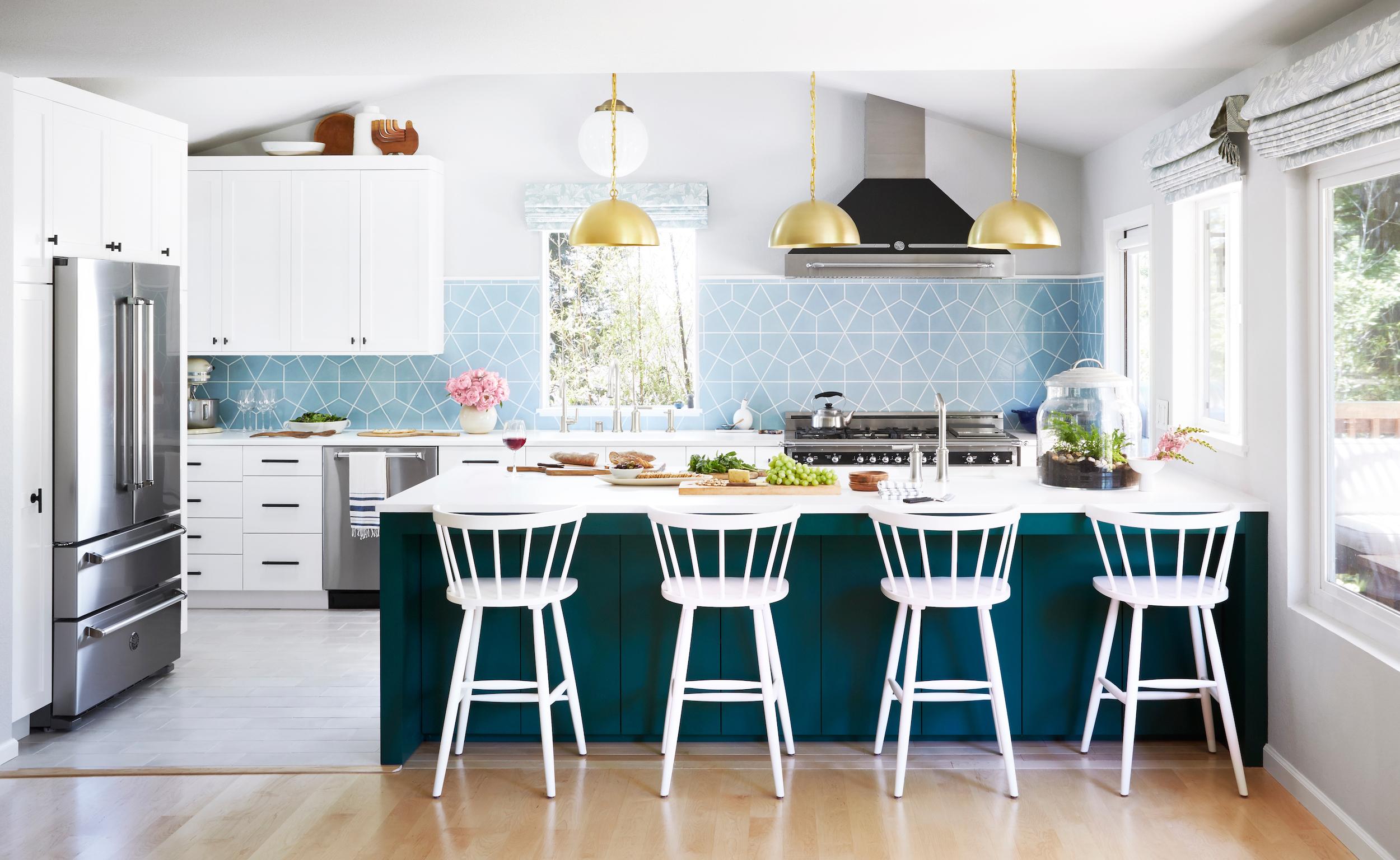
Sources: Refrigerator, Dishwasher, Range, Hood, Backsplash (Color: Crater Lake), Countertop, Globe Pendant, Brass Pendants, Roman Shade (Color: Romaria Aquatint), Concrete Floor Tile, Stools, Faucets (Finish: Brushed Nickel), Large Sink, Small Sink, Vase, Island Color, Wall Color, Cabinet/Trim Color, Tea Kettle
Now, before we really get into things, just a little, slightly traumatizing refresher on what this room used to look like:


The previous kitchen wasn’t HORRIBLE. It was fine. But for a house this size, it felt oddly out of scale. My parents’ house, nestled in the hills outside the city of Santa Rosa in idyllic Sonoma County, California, has four bedrooms and three bathrooms. It’s built for a family and my parents use it to host a lot of family events. So the kitchen just wasn’t functional for the way they wanted to use it.

Since you’ve all been so patient, I wanna chat a bit about why this project took so long. It’s hard to fully talk about it because much of it had to do with nuances with the contractor and I don’t want to say anything negative about him because that seems unfair given my platform. Aside from everything relating to labor, the project itself was a lot more complicated than it looks. PLEASE ENJOY THIS DRAWING SHOWING EXACTLY WHAT HAPPENED CONSTRUCTION WISE:

You look at that layout and think “OH YEAH JUST EXPAND ONTO THE DECK! EASY!” But in actuality there’s a ton of engineering and permitting that needs to happen when you expand a home, especially if you’re expanding over an open space (if you want to see what the exterior of the house looks like check out my post on the deck I designed as part of this project). So number one reason for how long this project took was probably the engineering/architecting/permitting. The other reasons are boring and convoluted and so I wont waste your time with them. Just know that none of it was my fault and it was all everyone else’s fault, K?
My parents bought their house at the base of the market and got an insane deal on it. It had been foreclosed, purchased for literally nothing, and flipped. The design decisions made by the flipper weren’t horrible, they were just super dated and cheap and gross. So okay yes they were hittable. The house was filled with anything you could get a great deal on at a big box hardware chain. The worst thing about the kitchen was the size. The second worse thing were the gross ARE-THEY-FILTHY-OR-NOT? countertops. The beautiful white Cambria countertops we replaced them with were a breath of fresh air (you can actually tell that they’re clean now!).

The very first decision made about the kitchen was the range. I took a wonderful tour of the Bertazzoni factory in Italy before this whole thing started and I loved this appliance the second I saw it. I love that ranges that have a bit more of an ornate, intricate look are having a moment right now. They give the room such a beautiful focal point.

Ormomdo has slowly collected blue Le Creuset dutch ovens over the years. Honestly my dream in life is to live in a world where all my food is cooked in blue Le Creuset. I would just drink wine straight out of a 3 quart dutch oven and just laugh about France and the meaninglessness of existence. It would be beautiful. I think they are such gorgeous, functional pieces. And also they are extremely helpful for styling photo shoots because they help bring in some pretty, vibrant color when you just need a little pop. The double oven feature of the 48″ Heritage range we chose has already come in so handy for holidays. Just another place to bake bread or warm up dishes.

Ormomdo and Orlandad. Ready to party.

One of the design decisions that probably doesn’t make the room any more photogenic but looks great in real life is the pitched roof in the kitchen area. This was not something we originally intended on doing. But halfway through construction we found out we were able to raise the roof, so we went for it. Ideally, we would have been able to have the ceiling be the same in the whole room. But unfortunately there’s an attic above the family room filled with my childhood toys, so my parents didn’t want to do that. Also it would have added a ton of cost to a project that was already ballooning (from an original bid of $76,000 to $150,000). In photos, it looks kinda weird that the ceiling gets higher in the kitchen. But in person it’s really lovely, creates a much airier and open space. I predict that whoever buys this house will be like WHY IS THE CEILING DIFFERENT IN THE KITCHEN THAN IN THE FAMILY ROOM? And they’ll remodel it to all be the same. But this configuration works for my parents so I’m happy with it.

During the course of this remodel, I made it kind of a mission to learn as much about the products and finishes I was putting into my parents’ house as possible. I went to Bertazzoni’s Italian factory to learn about their incredible 150 year-old family business, I went to Cambria’s factory in Minneapolis, I learned everything there is to know about window treatments at The Shade Store (side note: how gorgeous are these pretty patterned romans?), I went to Humboldt Redwood Company to learn where the lumber was coming from, and I went to Fireclay Tile on the Central Coast to learn about the intricate, handmade tiles I’ve loved since I used them at Orcondo. I was kind of shocked at how these tiles are made. They’re basically hand cut and hand-glazed, using extractors and other tools I’ve only ever seen at my friend Ben Medansky’s ceramics studio. It’s a magical factory and the people who work there are artists. Just beautiful to see.
The beautiful hexite shaped Fireclay tiles (color is Crater Lake) were a nod to Ormomdo’s love of blue. There are blue accents all over the house. I worried a bit that these would make the kitchen look like a swimming pool, but the color has just enough warmth that it keeps it out of that territory.

Orlando, Orlandad, Camilo, and Orlandisa (my sister, Elisa).

The door to the new deck was a great way of letting more light into this space. We selected the simplest, most open option available. We replaced the door hardware throughout the house with these simple black levers and they look a thousand times better than the twangy, twisty ones that were there before.


A lot of people are doing wood floors in kitchens these days. And I have to say that I’m totally on board with that trend and I love it. That was actually our first choice for this room and Orlandad was really pushing for it. However, because my parents just replaced their flooring in their whole house with solid wood and there is no natural stop, we would have had to refinish the large third level of the home (this house is oddly vertical btw, built onto a hill with three separate levels). But the constraints on using wood actually allowed us to bring in another beautiful material. We used a beautiful warm concrete tile from Rustico. I’m a big fan of faint grey, so I love how light it is and how it reflects light and keeps the room bright.

You can read about faucet drama in the post over on Emily’s site, but I’m pleased with how these gorgeous Kallista fixtures look in place.

Literally the first thing I do every single time I come home.

I figured the new kitchen needed new dishes to go with it, so I selected these very cute striped ones from Kate Spade.

Sources: Large Pulls, Bar Pulls, Cabinet Knobs.
Sometimes the smallest details are the ones you notice most. The hardware all came from Schoolhouse and I love it. The large scale pulls on the cabinets flanking the fridge are my favorite, but I also love the T-pulls on the cabinet doors. I chose black because I wanted a few little accents to bring in the wonderful matte black finish from the range.

Source: Wine Fridge (Similar to shown), Door Hardware, Light Filtering Roller Shade
The color of the island was challenging to capture in a photo. It’s not green, but it’s also not true blue. It’s the perfect color of peacock blue (the color is Benjamin Moore “Olympus Green”). Zeke and I had the hardest time color balancing these photos because in some images the island looked like navy blue and in others it looked like hunter green. LET THIS BE A LESSON TO ALL OF US that color really depends on space and what colors are bouncing into the room. So while I totally recommend this color, don’t go painting it on anything until you’ve tested it in the space. I honestly wouldn’t be surprised if it looked purple in your house IT’S THAT MUCH OF A CHAMELEON COLOR.
In other news, I realize painting the island peacock blue is not rocket science or a new invention. Basically everyone and their dog has done it by now. After I had selected all the colors for the kitchen, I noticed a lot of my blogger friends had chosen nearly identical color schemes for their kitchens. I don’t think it’s because we’re copying each other necessarily (though I see no shame in staling ideas from my talented friends), it just kinda happens and I don’t know why. I remember panicking a little when I saw my friend Will’s freshly-redone kitchen and thinking “HOW DID WE DESIGN BASICALLY THE SAME KITCHEN WITHOUT TALKING TO EACH OTHER?” I’ve chatted with Emily about this too. Like sometimes we accidentally do the same stuff and don’t know why. It’s a good reminder to try and be inventive, but also I don’t think you should be so obsessed with trying to be different that you end up creating hideous designs just to be sure you’re unique and special.

The home’s location, nestled between the Dry Creek and Sonoma Valley wine regions, made a wine fridge a necessity. My parents previously kept their wine at the bottom of a coat closet, so this was a major upgrade. Honestly, it required a lot of arm twisting to get them to let me put this in. They were like HOW RIDICULOUS WE DON’T NEED THIS and I was like HERE IS A FREE WINE FRIDGE OKAY BYE [speeds off in red convertible with Geena Davis].

There’s a light tube right above the refrigerator that lights the appliance like an angel on a daily basis. The previous kitchen had a terrifying light hole that made you feel like the world was ending every time you looked into it, so we covered it up and replaced it with a light tube. Honestly, every house should have light tubes all over. It’s energy efficient and provides such beautiful natural lighting.

How excited would you be if the inside of your refrigerator looked like this all the time? I seriously just want to buy only watermelons and green food just so every time I open the refrigerator I feel like everything is under control. In other news the other corner of the kitchen was a disgusting mess while we shot the inside of the fridge because Ormomdo has like 40,000 condiments and tons of food that is NOT camera ready. Just FYI so you don’t feel like your ugly gross refrigerator interior makes you a terrible person. You’re probably a terrible person for other reasons so calm down.

Source: Tea Towel, Seaglass Tumblers, Cutting Boards (Similar)
So there you have it! My parents’ dream kitchen makeover! After it was all finished my parents were basically like NEVER AGAIN but I already have a million other projects in mind for their house. Like bathrooms, windows, doors, etc. Honestly I need my own house so I can start renovating it because as annoying as renovations are, they’re so satisfying to finish. A huge thanks to all the wonderful sponsors who helped make this kitchen happen. My parents and I LOVE LOVE LOVE everything that went into the kitchen and fully recommend them.
Anyway, does someone want to give me like five million dollars so I can buy a house and do this to my own kitchen? Okay bye.
Love,
Orlando
PS: Don’t forget to head over to Emily’s blog to read juicy gossip about all the things I fought with Ormomdo and Orlandad during this harrowing renova
Orlando, you did a beautiful job, and I am so happy to hear how you worked with your parents on creating that balance between what they want, and what you know to be stylish. I clicked through to your friend Will’s kitchen when you mentioned you thought they were almost the same… but they are not!!! So, relax. He went Plain English and DeVol inset door inspiration…. you went for modern slab cabinet fronts… and the feeling of the two kitchens is completely different 😉 You may have shared a color family between the two… but other than that you went your separate (unbeknownst to each other) designer ways. 😉 Enjoy the beauty of your design!
Love Love Love
I am in love with this kitchen. The blue tile is gorgeous and the peacock peninsula is so striking. To me, it is fresh and interesting and just delightful.
Absolutely Fabulous as always
I read Emily’s blog first then had to come over to your blog to see the rest. I definitely agree with the space above the Frig. It would bug me until the end of time. I too wish the faucets were brass to tie into the pendants but again, “Oh well”. However I must say the one other thing that I would have done differently and that bothers me is…I would have made the handles on the appliances brass to pick up on the brass pendants. That is a real miss to me.
A beautiful, functional kitchen for sure! Good job, Orlando!
Love Ormomdo and Orlandad’s new kitchen! You did a beautiful job!
You are hilarious and your posts always make me laugh. The kitchen looks gorgeous; especially the tile with the island color. So good!
How are your parents to have such a wonderful son and vice versa. I luff it to pieces. xx
The photo of your parents makes my heart swell. They look so happy in this happy kitchen!
Another beautiful space Orlando! Well done and hilariously written as always. Just be careful about speeding off in a red convertible with Geena Davis! I’ve seen how that movie ends!
I love the color of the island. I’m glad you went with it…even though ti’s a naughty color. 🙂
This is a beautiful awesome Kitchen Orlando! Congrats on a job well done. Lucky mom and dad got to see their kitchen expand and become their ever so beautiful dream kitchen. I’m sure they’re counting their lucky stars that their son is one wonderful (did I say famous?) and talented designer!!
So lovely! I’m curious about the cost breakdown because I want to do an addition on our kitchen and have no clue how much the construction costs would be. I saw on emily’s site that cabinets were 30k – would you mind doing a general breakdown of the rest of the cost?
I L O V E it ! Stunning . It is so nice to read your perspective in Emily’s blog. Give it a rest you are hyper sensitive to colors and shapes. 98% of people won’t notice 😉 Beautiful!
Congratulations! Amazing work as usual. Love all the blue around the kitchen. Now, just i have to buy your book to peruse all your other work. I mean, you are truly inspiring for having completed the book and this project (and all others i assume you haven’t shown here yet) after the difficulties you have face in 2017. Bravo! Well done!
PS Also, your mom is amazing. Well done to her and your father for the family they have created.
I love this! Where is the hand decor (on top of cabinets) from?
Love you, your design work, taste, creativity, sensitivity, sense of humor, writing, & family. What thoughtfulness is put into every detail. So lovely at all the levels. Thank you for sharing about it all.