Photographs by Tessa Neustadt Courtesy Homepolish

Dear Diary,
If I had to make a list of my very favorite things to do in the entire world, looking at before and after pictures of houses would probably be near the top. There’s something insanely satisfying about looking at a gorgeous interior photograph and then looking at a totally ugly picture of what it used to look like. It’s like, no matter how pretty the after photo is, it’s always prettier in contrast to the revolting before picture. This is why when I meet people for the first time, I like to show them a hideous picture of myself in high school, obese with cystic acne and ugly hair. Then I pull that photo away to reveal my today-face. And people are like “OH MY GOD YOU’RE GORGEOUS! Especially compared with that disgusting troll doll photo you just showed me!”
The only thing better than looking at before and after photos of houses is looking at before and after photos of houses I designed. This has the added benefit of stroking my incredibly thirsty ego AND the same visual crunch that looking at regular before/afters. So you can imagine my joy when I remembered that, for once, I’d actually taken before photos at a client’s house. You may have seen this house written up on Lonny or Homepolish. But today I’m going to divulge all the nasty that came before this glorious rhinoplasty. GET READY!
THE LIVING ROOM:

A little history on this house: it was built in 1953 and was relatively untouched. It’s in San Clemente in a super cute, sleepy neighborhood that just happens to be across the street from the beach. My clients brought me on at the beginning of the renovation. Not because they needed me to coordinate anything (these people are wizards who basically always have a contractor on call – they live my dreamlife). I was brought on to give my design expertise and to make them feel more confident about knocking down, like, every wall that stood in the way of their freedom to live in glamour.

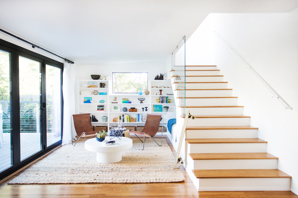
And, TA-DAH! Look at my new face! The room’s all “YOU HATED ME IN HIGH SCHOOL AND NOW I’M PRETTIER THAN YOUR DUMPSTERFACE!” In the living room, we kept many of the original features but ripped up the carpet to reveal (unexpectedly gorgeous) hardwood floors. And then (because interior design makes literally no sense) we covered those floors back up with a gorgeous sisal. We added in a 10′ wide accordion door, which opens up the front of the house to delicious, decadent sea breezes that remind anyone who visits that, yes, the world is a wonderful place.

There are lots of things about mid-century architecture that are charming, classic, and amazing. But that super weird half-wall plopped right in front of the door is not one of them. I’m not really sure what that guy was doing there, but he was a major buzzkill and had to be let go. We let him go as gently and tactfully as we could, yielding axes and screaming “WHYYYYY!!!” as we chopped him down and burned him in the fireplace.

What a difference a day make, huh? Here’s the same space without that disgusting carpet, which was for sure haunted and def filled with the misery and tears of a thousand ghosts. Also, HELLO. That chair (which I found at Lawson-Fenning and forced the clients to splurge on) is one of my favorite things on earth. After looking at before and after pics, obviez.

By the time my clients had finished spending a bajillion dollars on renovation (realistically about $200k), we were all basically like Oliver Twist. PLEASE SIR, CAN I HAVE SOME MORE? Except instead of soup we were hungry for art. My totally genius solution was to buy some gorgeous wallpaper from Black Crow Studio and have it framed at my cheap frame guy.

I learned a while ago that you can get away with doing furniture from big box stores if you find art and objects made by real artists. This spooky eyeball from Michele Quan Studio tells my clients “Hey, I’m watching you. If you move that pillow over there I’ll cut off your arms.” Also, since Michele Quan’s name is basically Michele Kwan, every time my clients look at this sculpture they can think back on a time where American figure skating really did Make America Great Again.
Living Room Resources: Sofa from Restoration Hardware, Painting Above Sofa from Black Crow Studio, Wicker Chair from Lawson-Fenning, Credenza from West Elm (no longer available), Eye Sculpture from MQuan Studio, Coffee Table from Crate & Barrel (no longer available), White Upholstered Arm Chairs from Wertz Brothers (vintage), Blue Throw Blankets from West Elm, Floor Lamp from West Elm, Painting Above Fireplace by Nick Bodimeade.
THE MASTER BEDROOM:

A really good before picture should be as disgusting as possible, so I’d like to thank the person who sold this house for like two million dollars and didn’t bother to paint their disgusting walls. YOU GO GIRL! Without these scruffy walls, this would look like a normal room. A normal room with a haunted carpet filled with ghost tears, but a normal room nonetheless.

This room was a pretty simple one to makeover. Since this is a vacation home, the clients didn’t need a lot of storage. This cleared the way for me to use a cute little dresser under the TV.

That big window looks out directly over the ocean, so my clients can listen to waves crashing as they dream about how much they love me and wish I lived with them in their gorgeous newly renovated home. (I could sleep on that luxurious megabench at the end of the bed!)

Being that this room is very bright and open, I decided on a pretty muted color palette of greys punctuated with hits of indigo.

My friend Ben Medansky made this vase in collaboration with my other friend John Parot. LET THIS BE A LESSON TO ALL OF US THAT THOSE WHO BEFRIEND ARTISTS ARE THOSE WHO FIND THE BEST POTTERY AND ART. And those without artist friends are cursed to die alone, freezing like the Little Match Girl, without ANY pottery.

I’m obsessed with this photo because I can’t stop staring at the Joni Mitchell/witch art I sourced for above the bed. Joni WITCHELL. I put her there so if they ever move anything (even the bedding to get inside) she will come alive and drag them to the pits of hell singing “BLUE-OOOO-OOOO-OOOO-OOOO!”

HOW CUTE IS THIS LAMP? That’s it. That’s all I had to say here.
Bedroom Resources: Bench from West Elm, Bed from CB2, Nightstands from Crate & Barrel, Chandelier from West Elm, Lamps from One Kings Lane, Dresser from West Elm, Bedding from West Elm (no longer available), Wool Art from Lawson-Fenning.
THE KIDS ROOM:
This is the kids’ room before we started renovation. I actually think this would have been a great room for kids. IF YOU HAD THE WORLD’S WORST CHILDREN WHO DESERVED NOTHING BUT PUNISHMENT AND DESPAIR.

Fortunately, my clients don’t have demonchildren, so we decided their room should get a colorful makeover. My favorite part is the wave pattern I painted on the wall (full disclosure: my client helped me paint and we spent the whole time talking about our feelings). It gives the room a subtle point of interest and gives a gentle nod to the fact that we’re at the beach. And by “gentle” I mean it basically screams “HEY THE BEACH IS RIGHT THERE DID YOU NOTICE? IS ANYONE LISTENING? DOES ANYONE CARE ABOUT ANYTHING AT ALL???”

Part of my design plan was that I threw away any toys, clothing items, or shoes that didn’t go with my beachy blues color scheme. Luckily, the adorable children were allowed to keep this cute skateboard. The rest of their toys didn’t fare so well and suffered the same fate as that weird room separator that used to stand in front of the front door. That’s right. I chopped them with an axe and then burned them.

An important fact about skateboards is that they’re much more useful as home decor than as a floatation device. People who use them in the ocean have a 100% higher chance of being bitten in half by a shark than people who lean them in corners and just look at them. THE MORE YOU KNOW.
Kids’ Room Resources: Arrow Shelves from Etsy, Rug from Rugs USA, Bunk Bed from Restoration Hardware, Beanbag from Fatboy, Dark Paint Color Caribbean Cool by Benjamin Moore, Light Paint Color Water Drops by Benjamin Moore.
THE HALLWAY:

You know what’s totally depressing? A totally depressing hallway. Like this one, which screamed “I WAS ONCE LOVED BUT IT HAS BEEN SO LONG SINCE I’VE BEEN TOUCHED BY A HAND THAT TRULY LOVES ME.”

But hey, ripping up carpet, changing out cabinet hardware, and refinishing the floors can do wonders! (Sidenote: mid-century houses really knew what they were doing with storage. Like everything that can be storage, is storage. Now builders are like “LET’S PUT A HUGE HOLLOW WALL HERE WITH NO DOORS IN IT!” People in the 50s really knew that the key to happiness was having a place to hide all the things that brought shame upon them and their families.)
Hallway Resources: Hardware from Liz’s Antique Hardware.
GUEST BEDROOM:

This is the type of guest bedroom you wish you had if you have guests that come and stay for too long and throw their towels all over the bathroom like they’re at a hotel. But if you actually like your guests, perhaps a cleaner, more inviting space would be better.

A CLEANER, BRIGHTER SPACE LIKE THIS ONE GIRL.

I was obsessed with this pot from Lawson Fenning, which is handmade and weirdly comforting to touch. I spent a good five minutes caressing this thing. It was very weird in an East of Eden petting/spooky way.
Guest Bedroom Resources: Bed from CB2, Nightstand from CB2, White Linen Bedding from Parachute, Vintage Map from Shopclass, Lamps from Schoolhouse Electric, Pot/Vase from Lawson-Fenning.
THE KITCHEN:
The man in this photo is saying something to the (hidden on the right) real estate agent I think you need to all hear. “MA’AM, THIS KITCHEN MAKES ME WANT TO WEEP AND JUMP INTO THAT WALL-OVEN.”

But with a little bit of design ingenuity and tons of physical labor I didn’t do myself, the kitchen was transformed into a culinary wonderland any modern cook would have to be insane not to love.

The Fireclay tiles are my favorite accent in the otherwise all-white kitchen. They add just enough color while still allowing the kitchen stay bright and peppy, like the 1950s housewife who probably originally inhabited this kitchen, popping pills and drinking wine whist cooking for her perfect family.

Pretty sure I got them a runner after this, but for now this area serves as prime SLIDING IN SOCKS territory for the kids.
Kitchen Resources: Range from Thermador, Integrated Refrigerator from Thermador, Countertops are White Caesarstone, Backsplash Tile is from Fireclay Tile.
THE GUEST BATHROOM:

Before, the guest bath was cramped because it had unnecessary walls. But I was all “TEAR DOWN THAT WALL MR GORBACHEV!” And the walls came down to reveal a gorgeous, open bathroom.

The bathrooms are pretty simple and modern. But I added a little warmth and charm with small brass mirror and cute hand towels.

The faucets are the same Jason Wu for Brizo fixtures I have. But these are chrome and mine are black. They look chic in chrome. Who knew?!?

Most nights, I lay awake screaming because I never asked my client where she got these adorable beach towels. The rectangular bathtub is pretty awesome too. I have a thing for rectangular tubs.
Guest Bathroom Resources: Tub from Americh, Wall Tile Eleganza Tile, Foor Tile from Eleganza Tile, Tabletop Mirror from Lawson-Fenning.
THE DINING ROOM:

The dining room was previously cut off from the kitchen by a big wall. We had that wall torn out so the whole space would feel more open and inviting.

Now you can walk from the living room to the dining room to the kitchen to the library without going through one door! THE FUTURE IS HERE, AMERICA!
Dining Room Resources: Blue Stools from Joss & Main, Table by PCH Series, Chairs from West Elm, Rug from Rugs USA, “Cocktails” Art is Vintage.
LIBRARY:

This is the cute little library that overlooks the back yard. Previously it was a pretty unusable space, covered in haunted carpet. (Sidenote: I’m not anti-carpet. I love it. It’s just kind of not something that lasts forever. You have to clean it regularly and replace it when it gets too nasty to come back).

WOOOP! Here’s the new space! We got rid of that crazy railing and put up a glass barrier to make the space feel more open while also protecting small children from falling from terrifying tall heights.

See how crazy and choppy it was before?

Now this room has a little under-the-stairs daybed (that’s actually a twin mattress and can sleep a guest).

The shelving, previously empty and neglected, was filled with objects, a mixture of things my clients already owned and accessories I sourced for them at the flea market.

There are accordion doors in the back of the house too. So the sea air can flow all the way through to the back yard. And if you squint your eyes you can see a bucket of booze on that outdoor dining table, just waiting for you to come over and guzzle.
Library Resources: Round White Concrete Table from CB2, Rug from Rugs USA, Leather Sling Chairs from Urban Outfitters (no longer available), Pouf by Nate Berkus for Target, Interlock Ring Sculpture by Michele Quan.
Alright ladies. That’s it! I hope this tour has inspired you to complete your own glamorous before and after makeover this weekend. Make sure to take DISGUSTING before pics before you start. GODSPEED!
Love,
Orlando
Gorgeous and made even better with your running commentary. Any chance of sharing your “cheap” frame fella??
This is amazing and beautiful. And I would also love to know the name of your cheap frame guy! Have some things that are sad in a cardboard tube.
I think even root canal work would be entertaining with your commentary! Lovely work, as ever.
LOVE EVERYTHING! Wanna trade spaces? You have the best style! Also truly enjoyed the piece on FireClay Tile I read today. That kitchen is LEGIT!
xx
Carissa
WOW…..I am in ore of what you have created here. The black pops in the window frames are magical. You truly are an inspiration. I’m in love with your work. All the best with future projects, I look forward to following them along the way. Cheers, Mandie Wright NSW Australia
Wow, stunning. I love everything. Maybe I would have kept that 60s bathroom vanity but gutted around it but otherwise I love that the old school vibe is carried over successfully by leaving the mantlepiece & the hallway storage.
This is so unbelievably beautiful! Just looking at the photos of this new house, I can feel the light, salty sea breeze caress my blinking eyelids (even if I’m only staring at my bright screen). Orlando, it is evident that every detail is carefully considered by you. It turned out gorgeous.
Wow, this little beach house is absolutely stunning. I can just picture myself sitting there listening to the waves, like you said! Thanks for sharing!